Company colors
Below are main company colors derived from the CGE logo.
Brand Color Palette
These colors are used for all game related marketing activities such as ads, social media posts and other communication. Examples of how these colors are used can be found further down on this page.
Primary palette
Accent palette
CMYK: 0 93 82 0
RGB: 255 66 66
HEX: #FF4242
CMYK: 0 59 100 0
RGB: 254 106 47
HEX: #FE6A2F
CMYK: 0 29 100 1
RGB: 254 175 21
HEX: #FEAF15
CMYK: 71 0 55 0
RGB: 61 211 155
HEX: #3DD39B
CMYK: 55 0 1 0
RGB: 100 208 248
HEX: #64D0F8
CMYK: 55 65 0 0
RGB: 183 94 237
HEX: #B75EED
Neutral Pallete
Name: Neutral 800
CMYK: 0 0 0 80
RGB: 81 81 81
HEX: #515151
Name: Neutral 600
CMYK: 0 0 0 60
RGB: 114 114 114
HEX: #727272
Name: Neutral 400
CMYK: 0 0 0 40
RGB: 154 154 154
HEX: #9A9A9A
Name: Neutral 200
CMYK: 0 0 0 20
RGB: 198 198 198
HEX: #C6C6C6
Name: Neutral 100
CMYK: 0 0 0 10
RGB: 245 245 245
HEX: #F5F5F5
Game Color Pallete
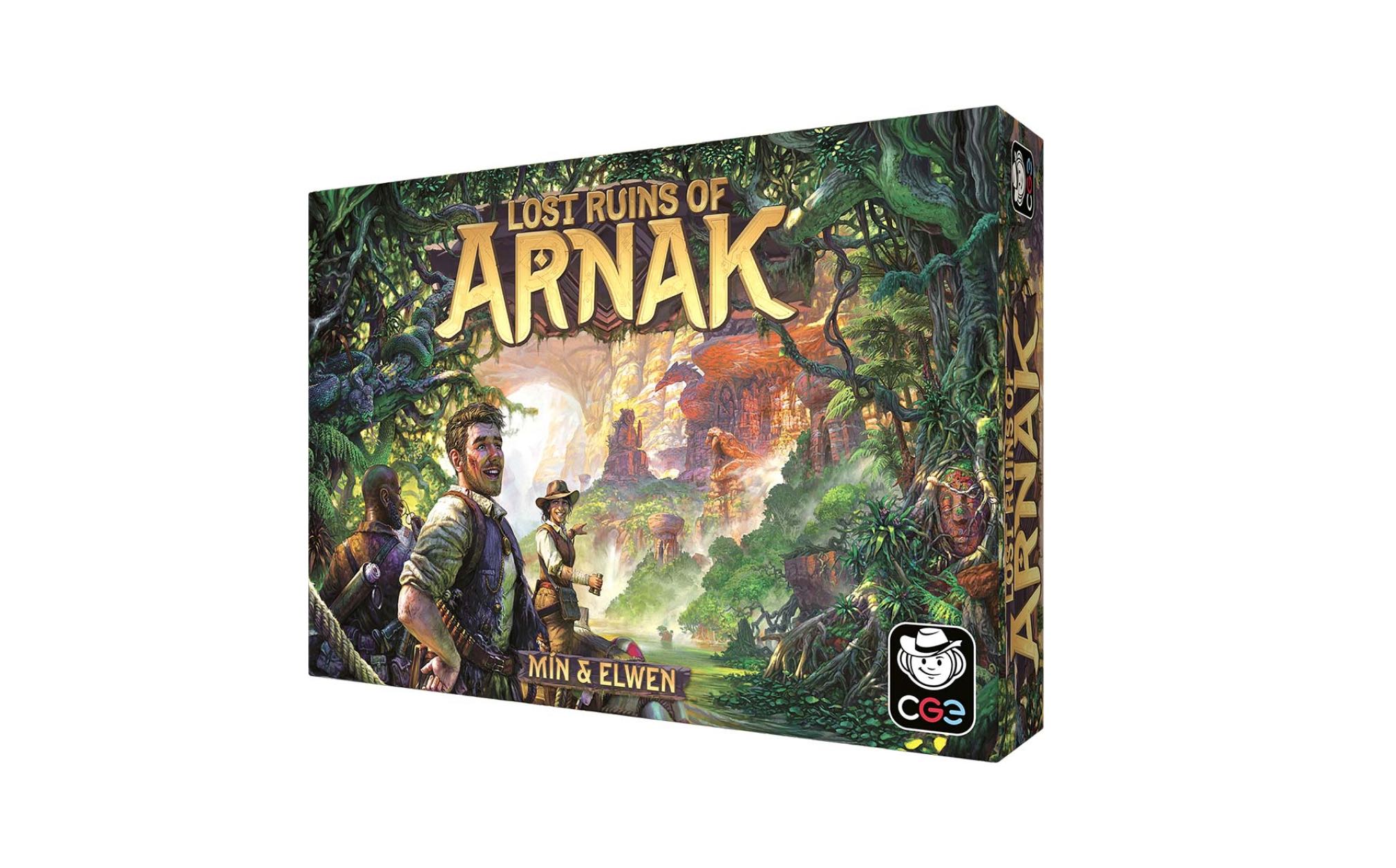
However, if the game palette is too bright, you need to adjust the lightness of the primary color so it matches the lightness of the brand primary palette. Below, you'll find the example color palette for Lost Ruins of Arnak.
Primary Color
Accent Color 1
Accent Color 2
Color Combinations
To maintain the integrity of the visual identity, it is essential to adhere to the proposed color scheme. Typically, we use one primary color, which can be complemented by one or more accent colors.
Monochromatic Usage
Accent Palette Usage
Game Palette Usage
Examples of color combinations
Communication made for multiple games


Communication made for a single game / family