Logo Variants
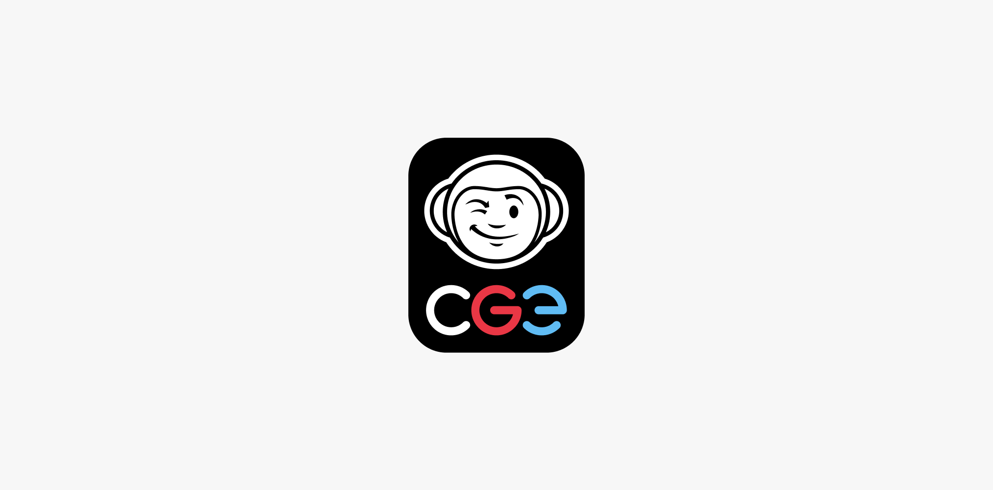
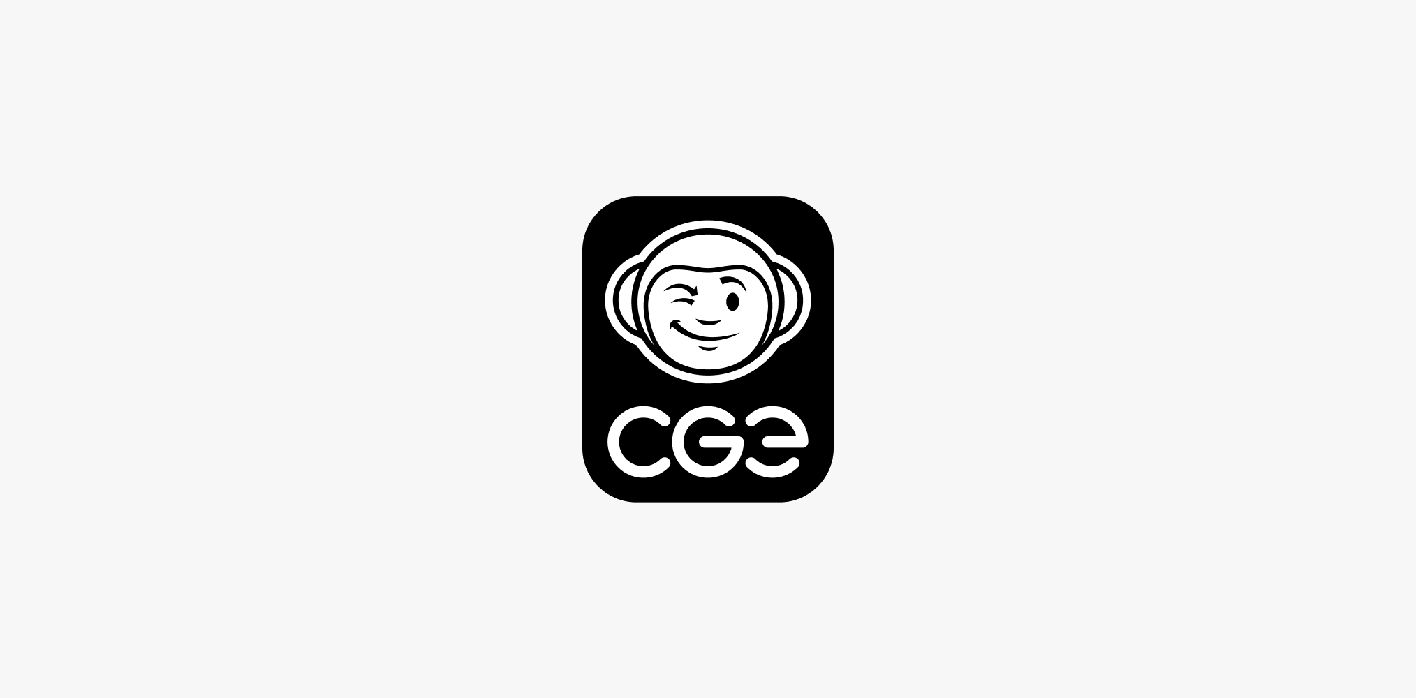
CGE uses two variants of the logo. One is intended for official company presentations, and the other is used for most game related marketing materials.
Full Color Variant
Monochrome Variant
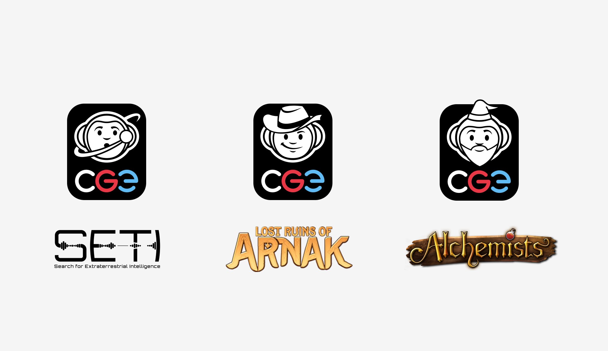
Special CGE Logos
Warning: Only variants created and authorized by CGE are allowed to be used. It is strictly prohibited to create one’s own unauthorized versions for your own marketing materials.
Logotype
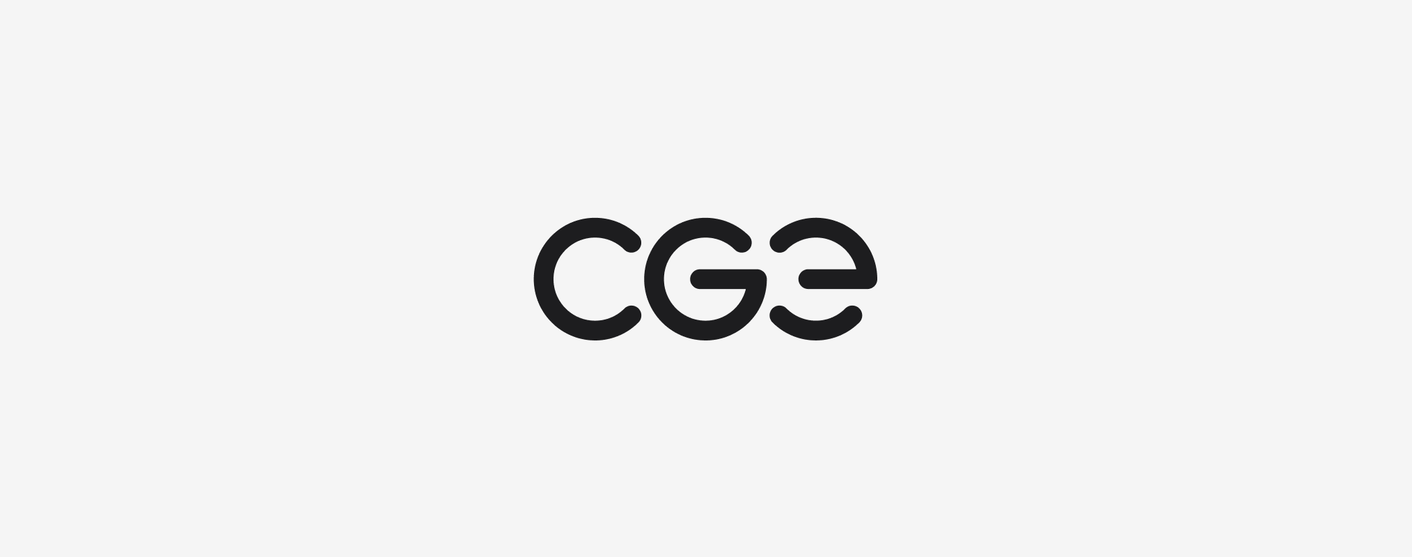
CGE uses two variants of the logotype. One is intended for official company presentations, and the other is used for most game related marketing materials.
Full Color Variant

Monochrome Variant
Positive and Negative Appearance
We have two variations of the logo which are designed for use on light or dark backgrounds.
Full Color Logo Display Variants
Positive version
Negative version
Monochrome Logo Display Variants
Positive version
Negative version
Full Color Logotype
Full color logotype has only a negative display on fixed black background.
We use this version in materials intended to present the company. It is used on official company merchandise or on game packaging. This logotype variant has fixed colors. More details can be found in the Colors chapter.

Negative display
Monochrome Logotype
Monochrome logotype can be used both as positive and negative.
We use this version in materials intended to promote games. This typically includes social media posts, advertisements, banners, etc. This logo variant follows the color rules. More details can be found in the Colors chapter.
Positive version
Negative version
Logo Elements
The logo consists of two main elements – the avatar and the logotype. These elements can be combined within marketing formats. However, these combinations are not logos and should not be mistaken for logos.
Avatar

Logotype

Safe Zones
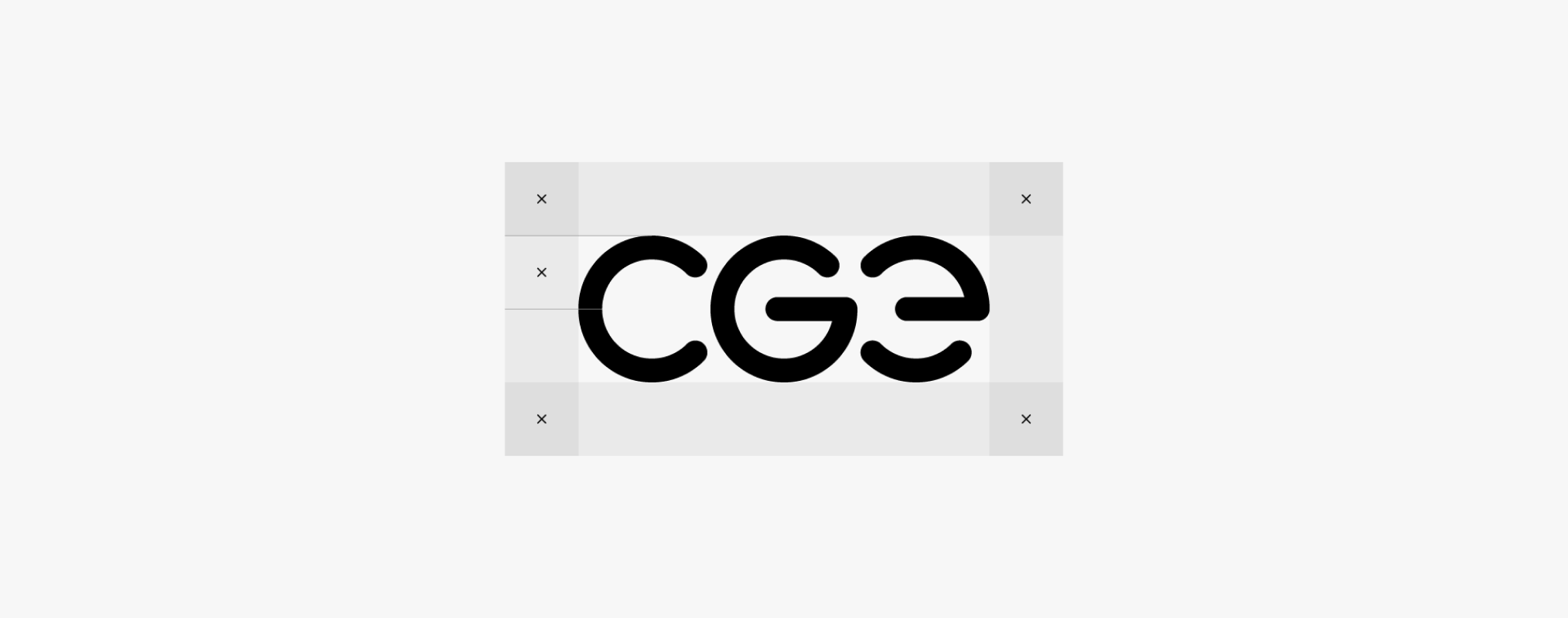
To maintain the visual integrity of the brand, a protective zone is established for both the logos and individual elements. This zone defines the space into which no other graphics may be placed.
Logo
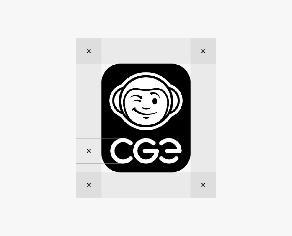
Monochrome version
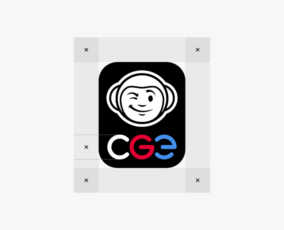
Full color version
Logotype
Minimum Size
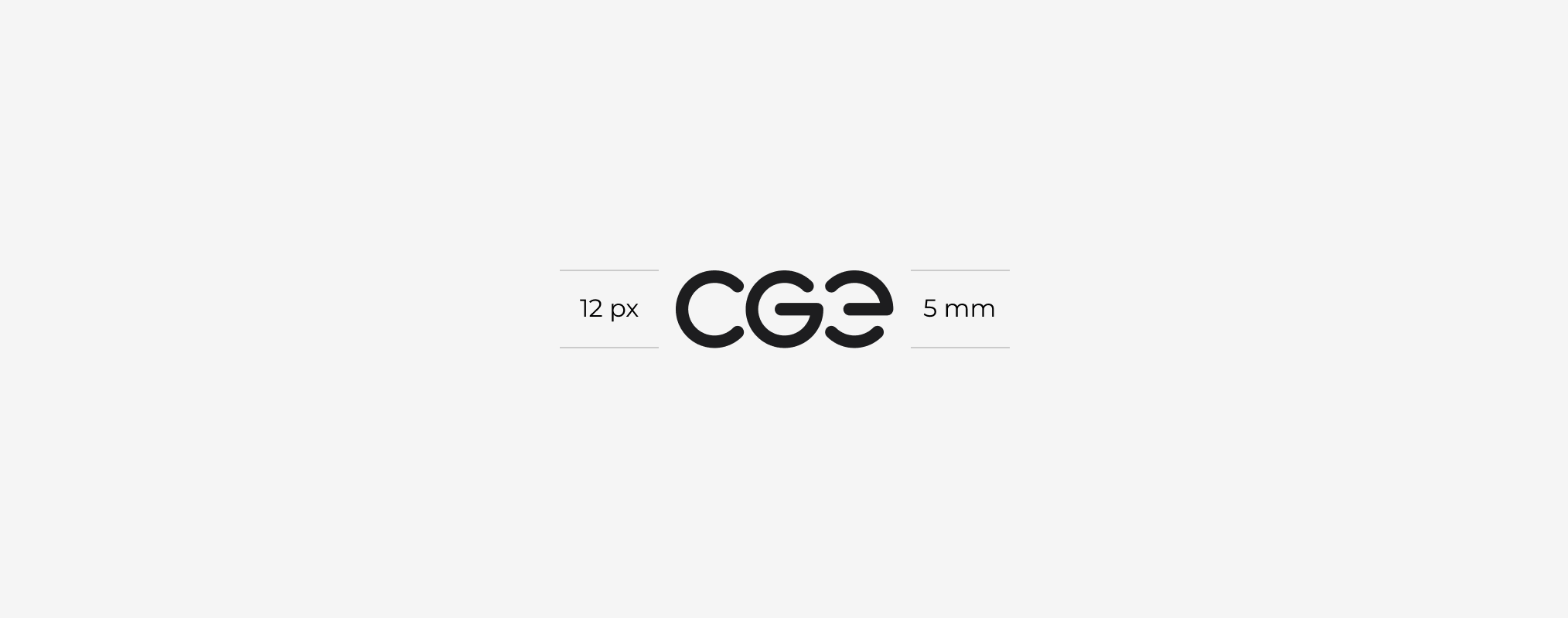
To ensure good readability and recognizability of the logo, its minimum size must be respected.
Logo
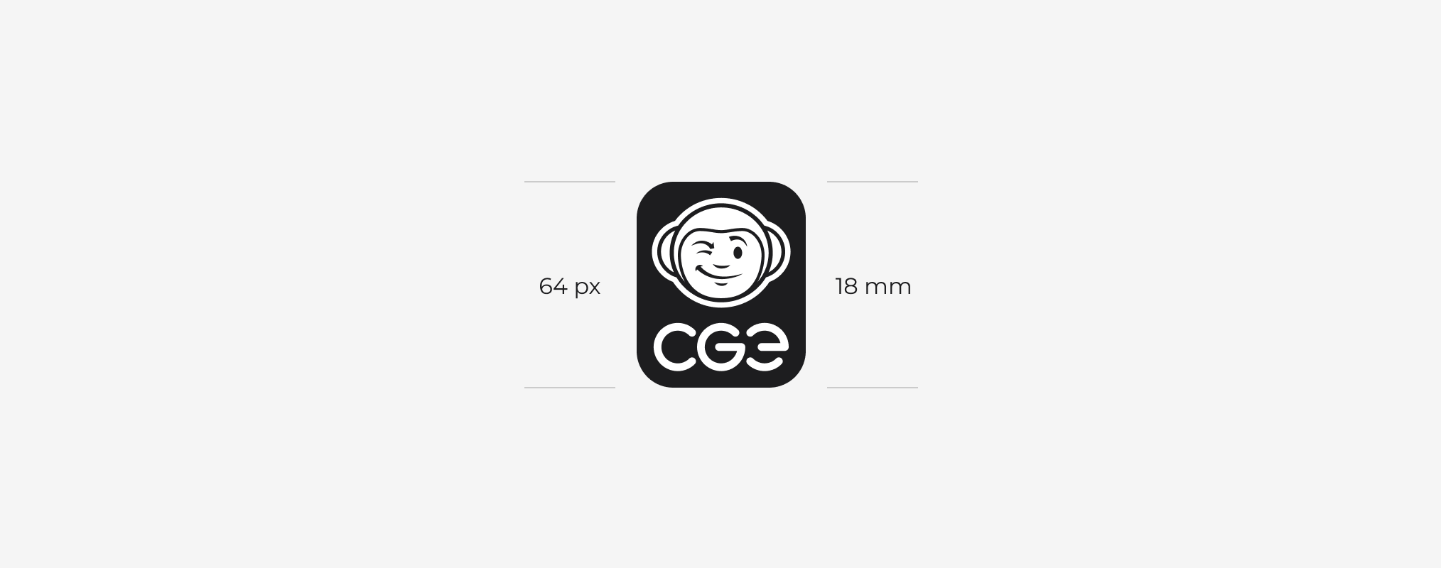
Avatar

Logotype
Logo on Background
The logo can be used on various backgrounds. It is always necessary to ensure the correct choice of colors and background to maintain good readability.
Background Tonal Range

Usage Examples
Use of the logo on a solid-colored surface.
Use of the logo on an illustrated surface with a color overlay.
Use of the logo on an illustrated background without a color overlay.
Use of the full-color variant on an illustrated background without a color overlay.
Incorrect Usage Examples
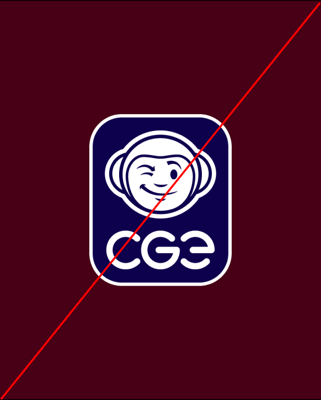
The color of the logo does not correspond to the background color.
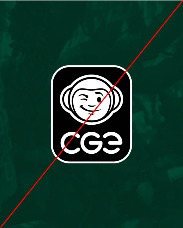
The color of the logo does not correspond to the background color.
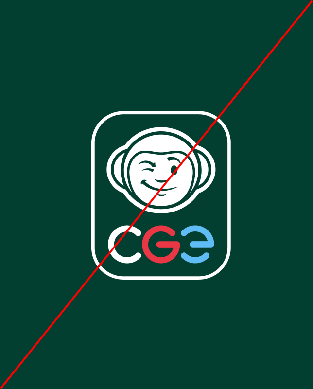
Recoloring the full color variant. Colors of the full color variant cannot be changed.
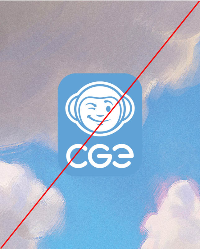
The color of the logo is too bright. When recoloring the logo, use proper tonality.
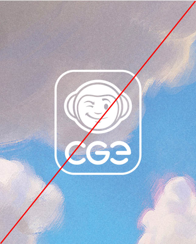
The logo cannot be used without base color on complex backgrounds.
Prohibited Use
Below are defined prohibited ways of using the logo.
Incorrect Usage Examples
Deforming the logo
Using a incorrect color scheme
Logo rotation
Adding effects
Changing the composition
Change the logotype
